AccelR8 Ventures

AccelR8 Ventures is a Boston-based impact fund investing in climate technology. This top-down rebrand was rooted in their unique investment strategy: investing in technology that will create systems of exponential positive change for our planet. The logo embodies both the systems change in which AccelR8 invests and their signature “8”.


LangChain
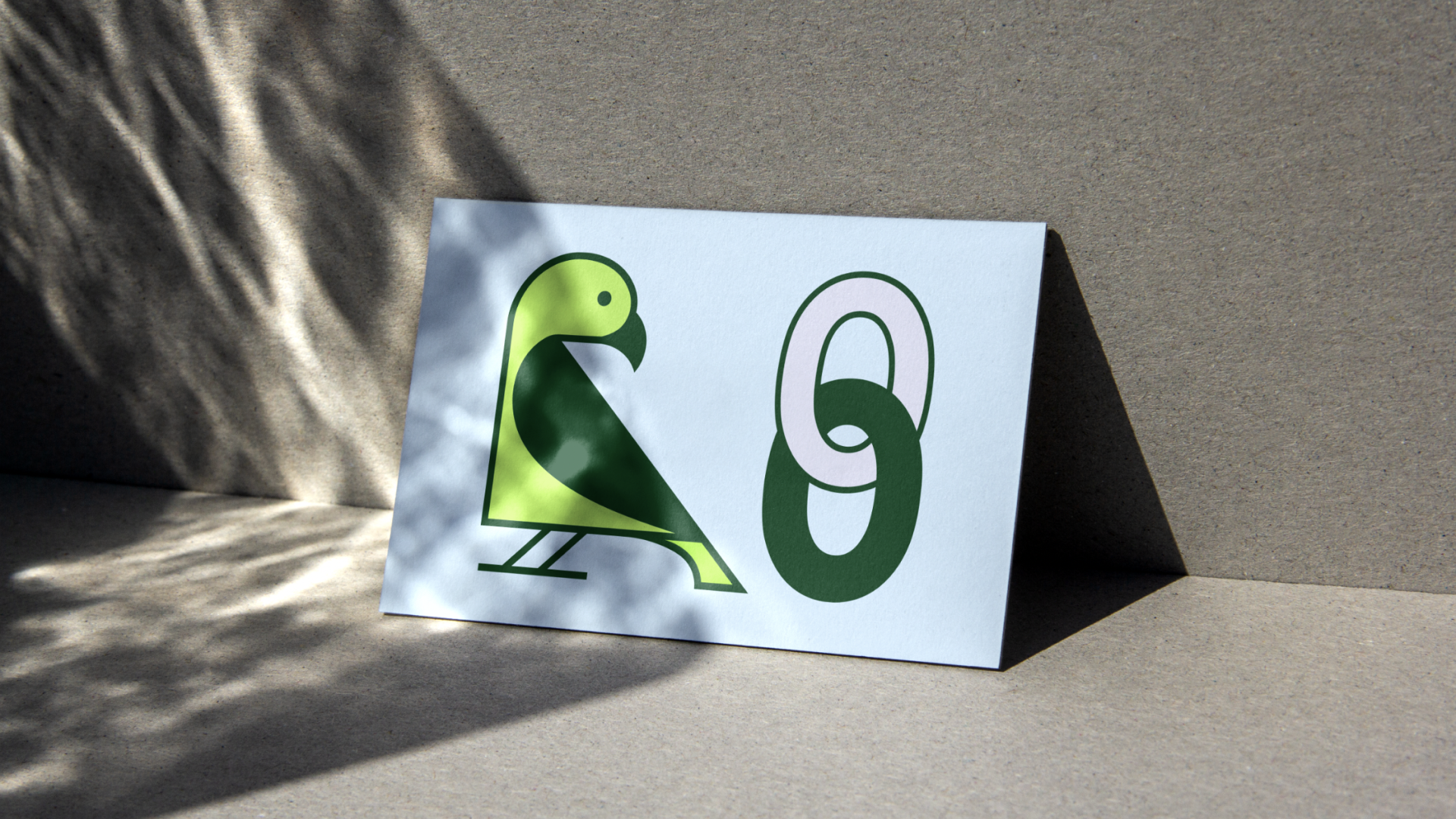
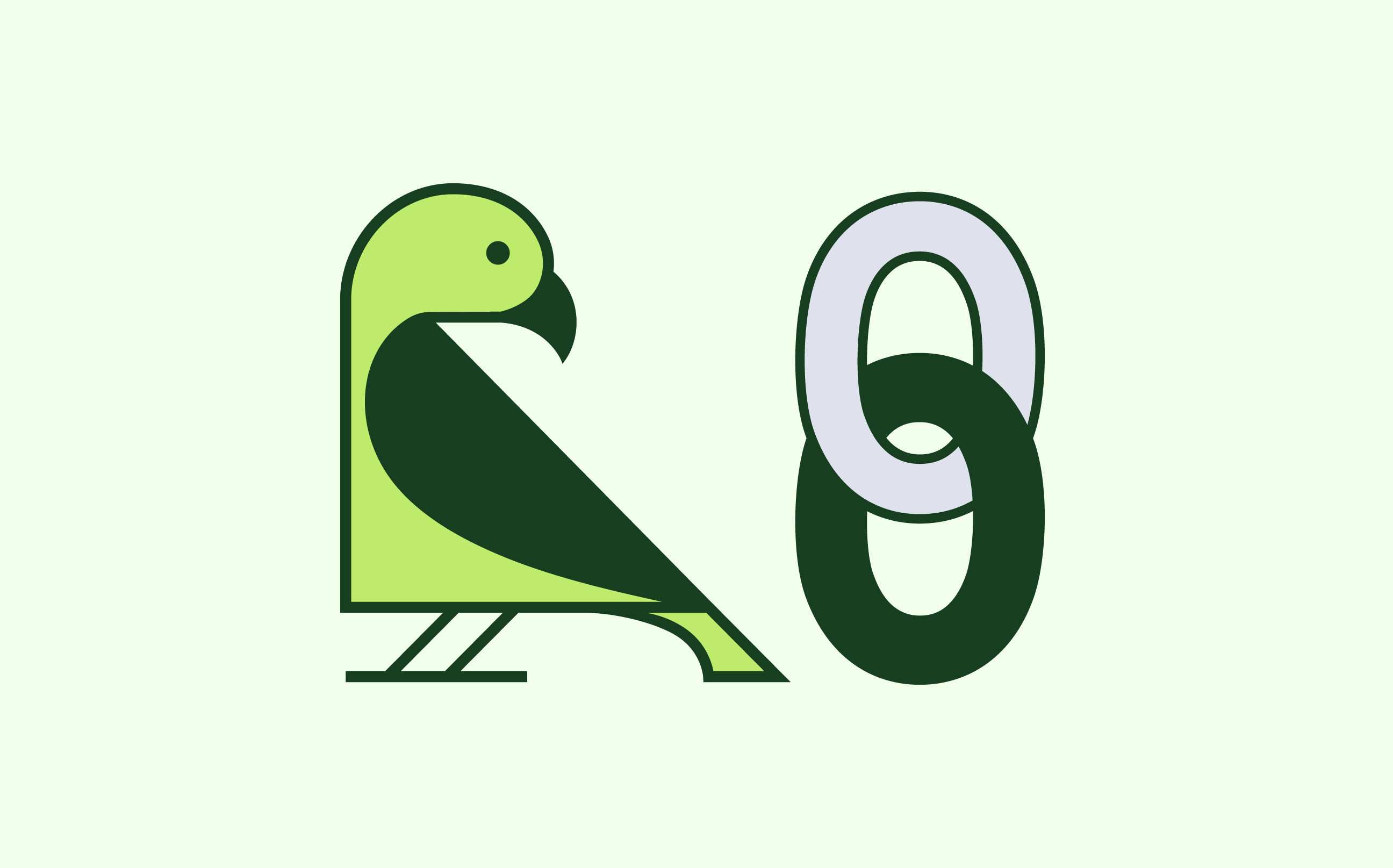
LangChain, the leading open source framework for builing generative AI applications, asked me to explore a variety of logo directions to replace their distinctive parrot and chain logo, currently made up of iOS emojis. This case study explores how the start up could evolve their visual identity while retaining the recognizability, accessibility, and charm of their current logo.
Almost all logo directions retain LangChain’s existing logo structure of a separate bird and chain. This decision was made to ensure that LangChain could still be referred to as the iOS emojis, and thus users would still be encouraged to use those emojis to refer to the company across Twitter, Github, etc. For this same reason, the parrot is always colored green and is always standing to the left of the chain.
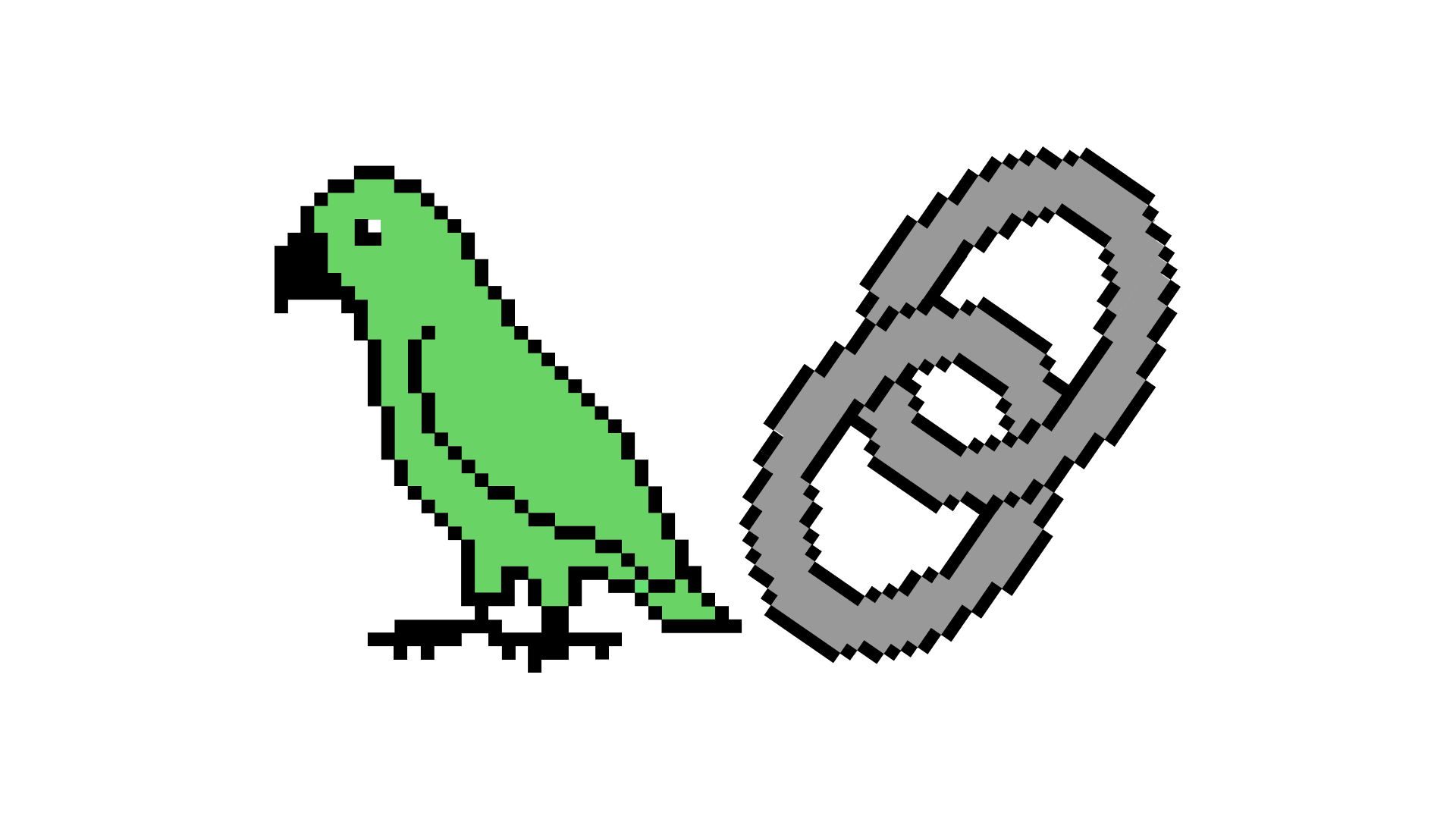
The logo above is inspired by the work of Susan Kare, who designed the first Apple icons in the early 80s. The direction plays into LangChain’s recognizable iOS emojis and harkens to the early beginnings of the tech world with a hint of humor and self-awareness.
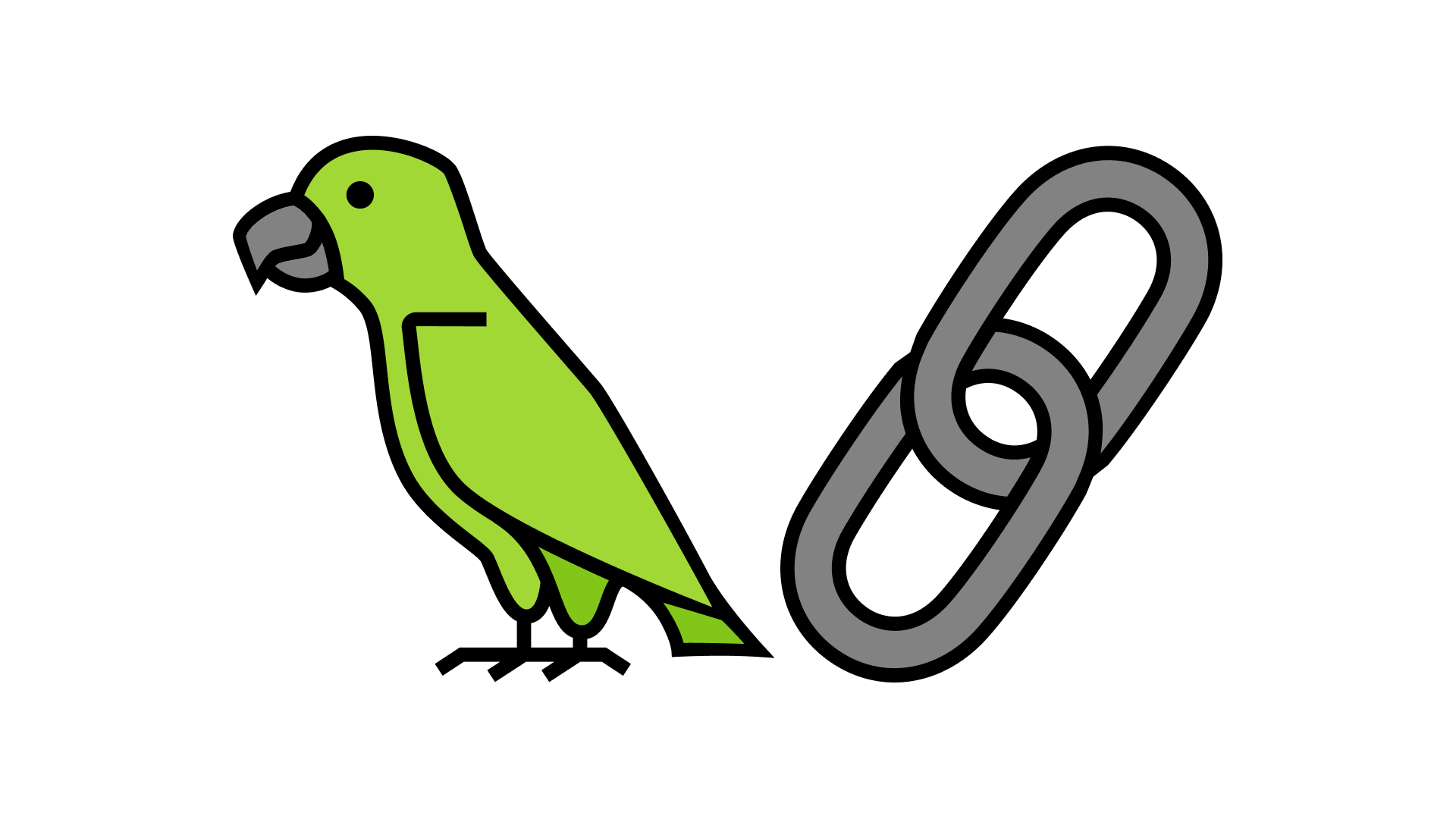
This logo uses sharper corners and lines inspired by many of the monospaced typefaces used in coding editors. However, it’s overall effect is warm, humble, and familiar. Certain aspects of the parrot were inspired by Egyptian hieroglyphs — in a way, the LangChain logo acts as a hieroglyph, with the parrot representing “Lang” and the chain representing “Chain.”
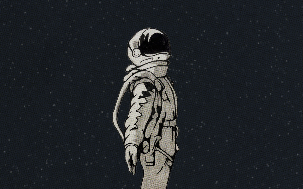
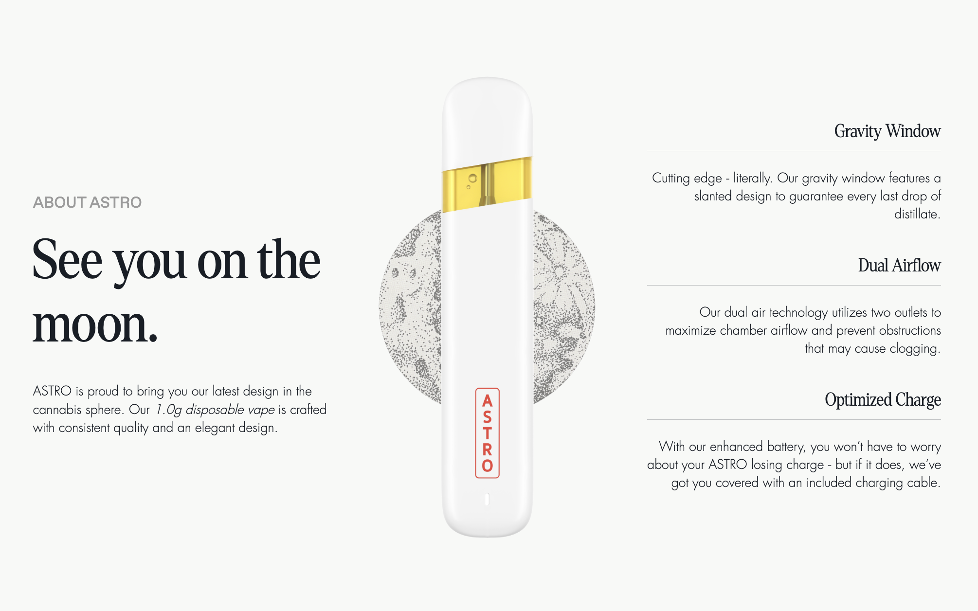
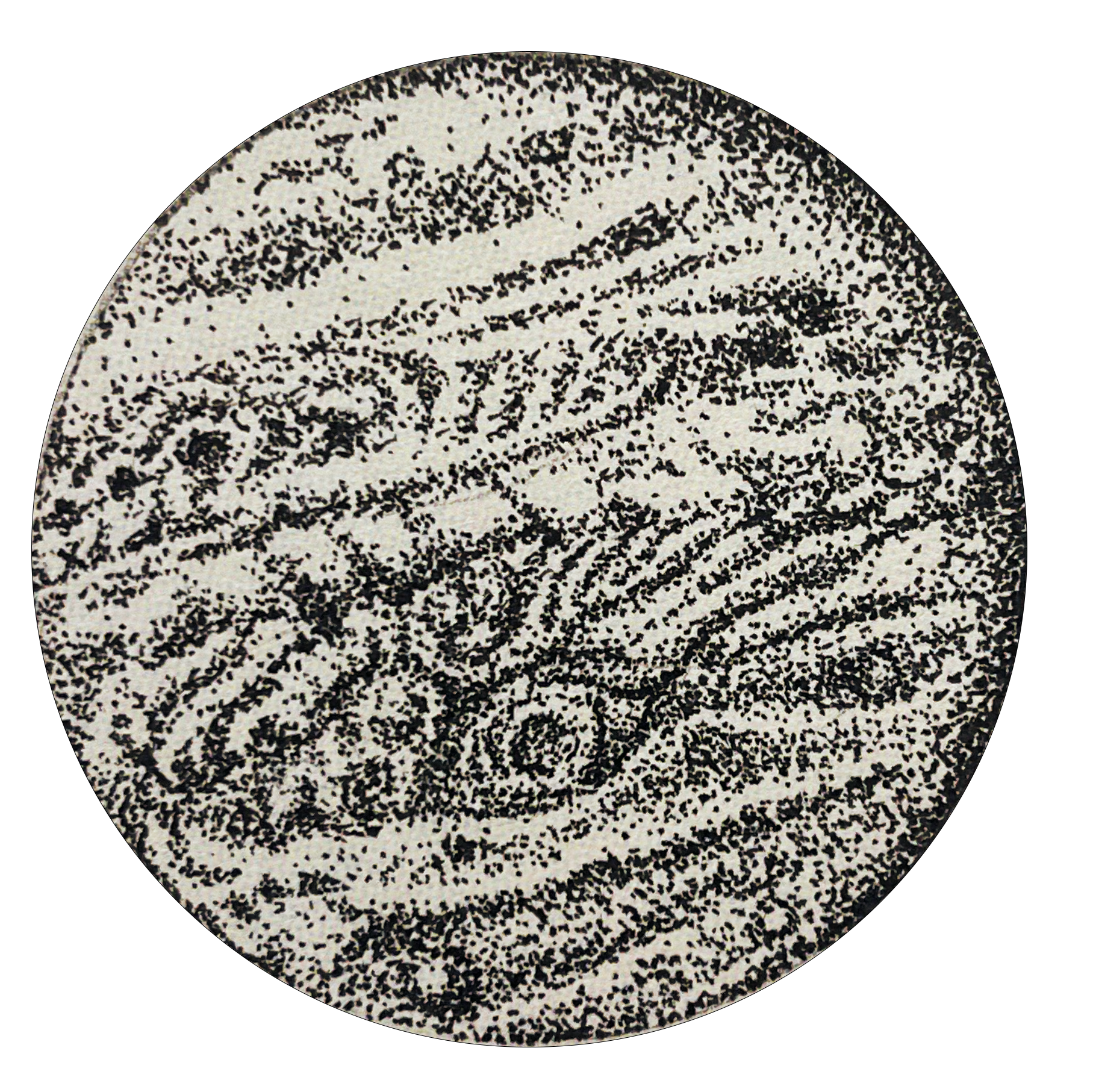
ASTRO
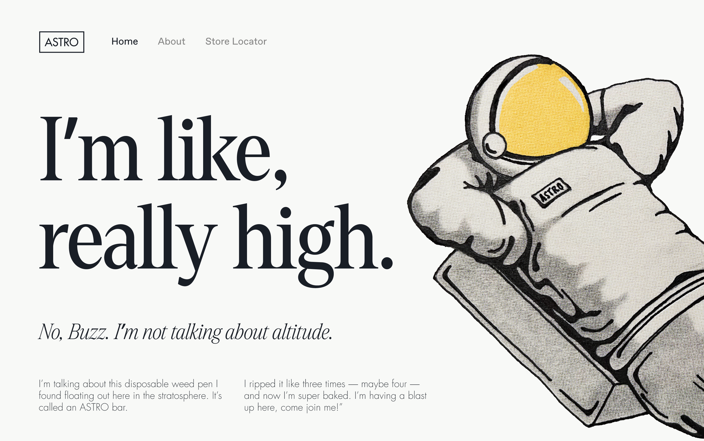
This rebrand is full of humor, nostalgia, and Space Age era illustrations. ASTRO, a high quality weed pen company, was looking for a visual identity that’s playfully self aware and embraces the laid back nature of cannabis use, though avoids weed-brand stereotypes. I drew inspiration from 1960s Marvel comics, and worked with the ASTRO team to create ASTRO himself — a chilled out, adventurous, and, well, high astronaut.
The nostalgic tone is carried over through the use of Denton Display and Futura typefaces on the website; Dinamo’s Favorit brings the brand back to present day. The color palette is inspired by moon dust and and sun-faded comic books. Web design and UX by Eli Simon.
Access the ASTRO website here.
Access the ASTRO website here.

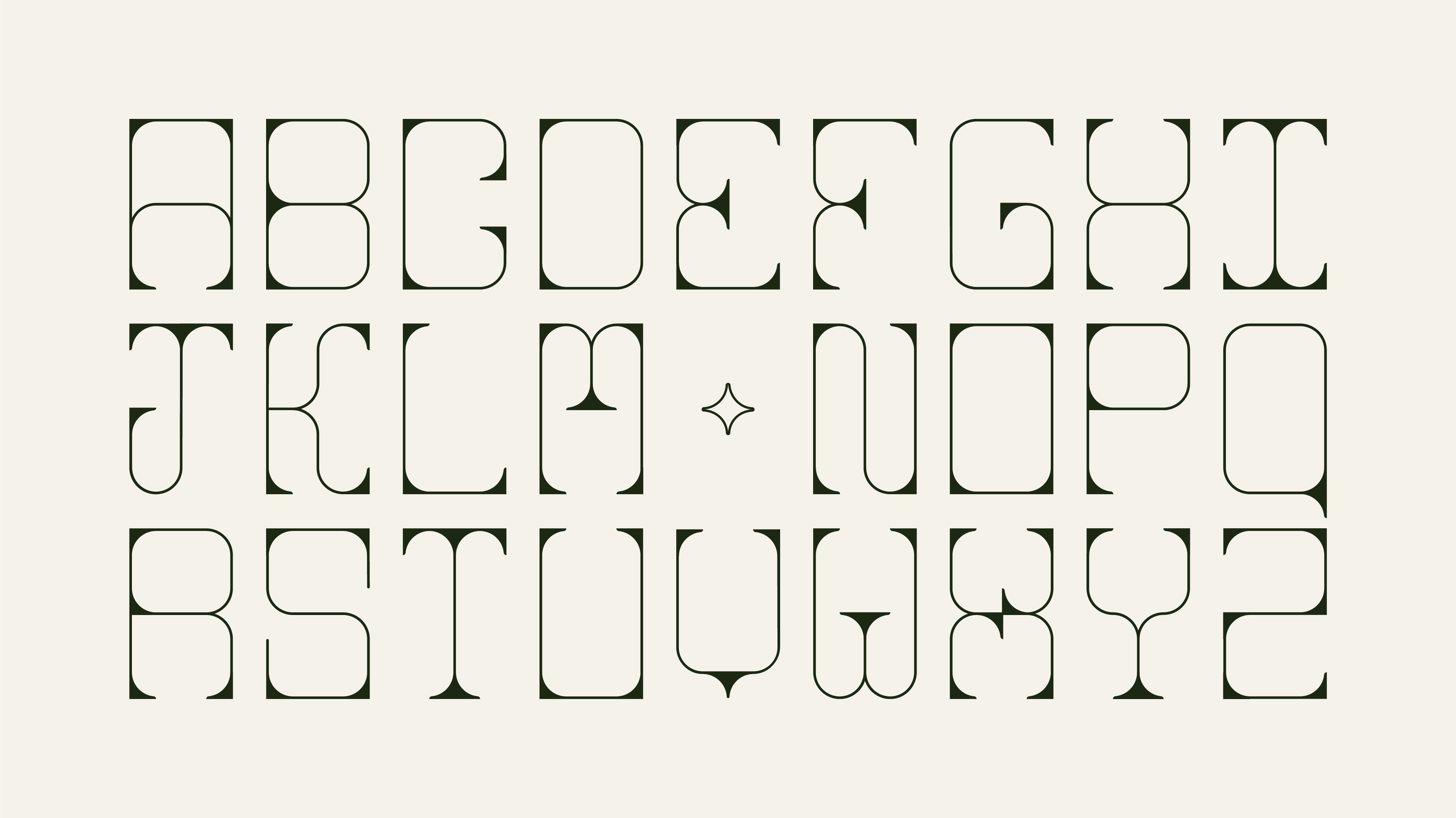
Asteria

These typefaces were inspired by playing cards and elaborate iron gates. However, the true fun of this eclectic display font is that each letter — save only for the “V” — is created from the same rectangular “frame” and four ovals. Asteria comes in two different styles: an ornate and a simple version.


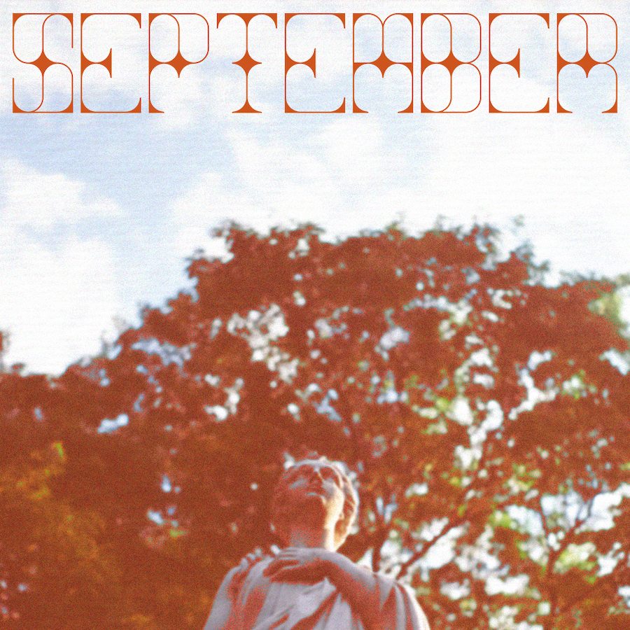
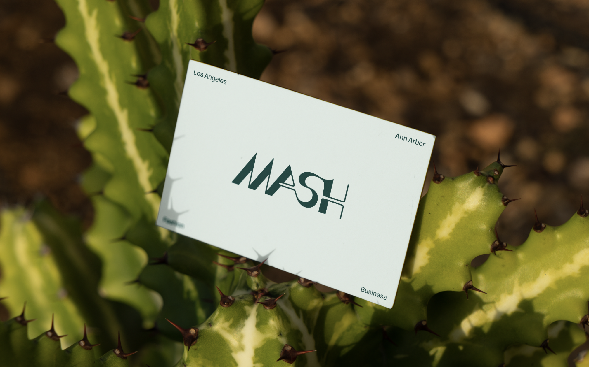
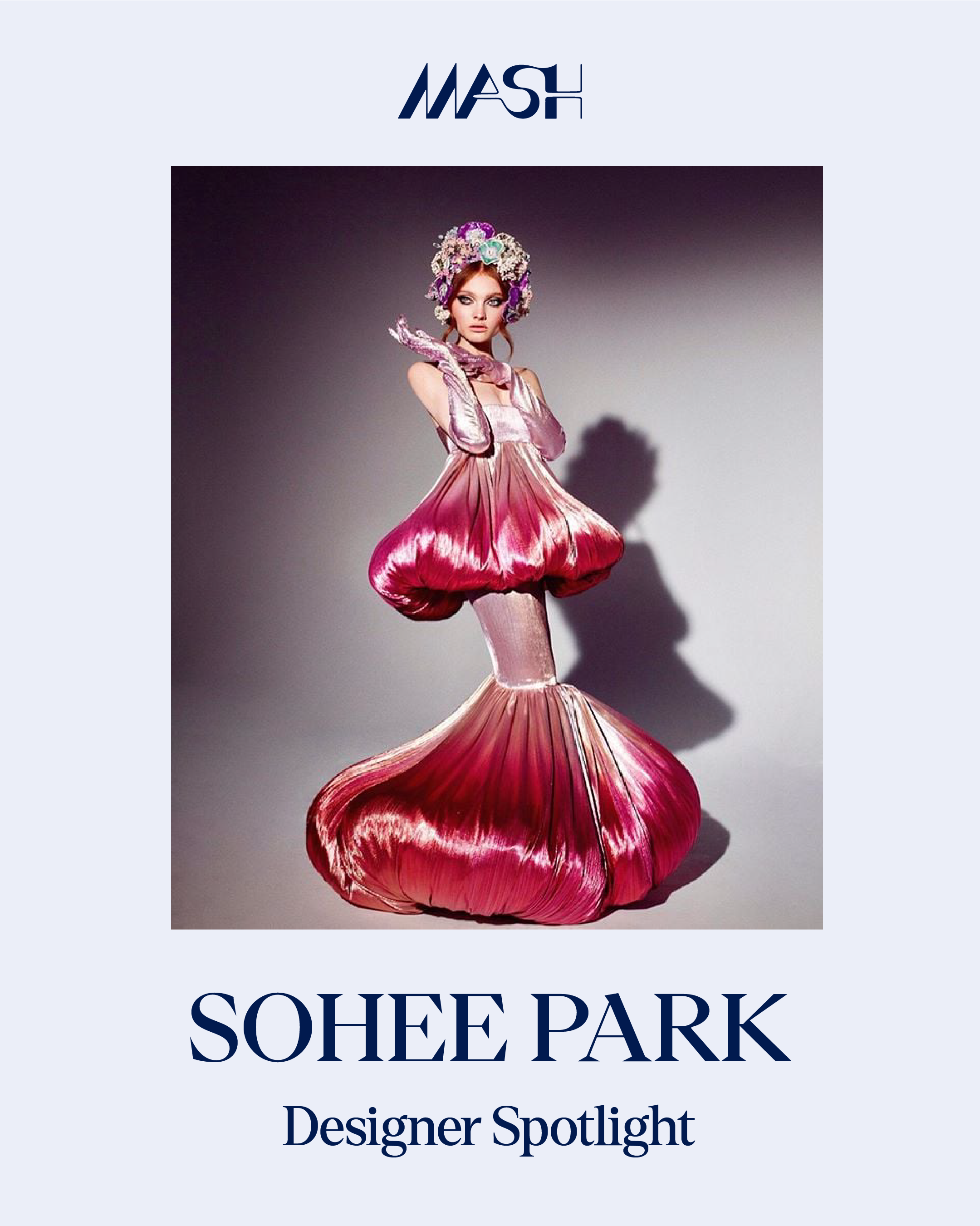
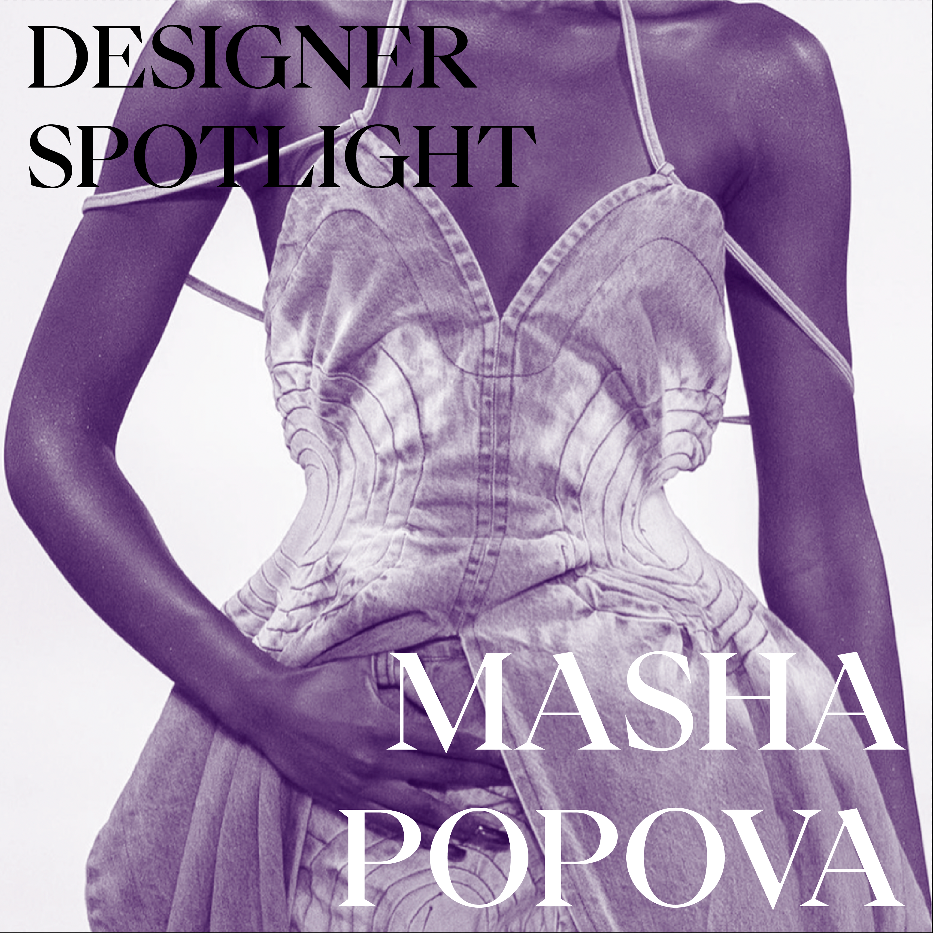
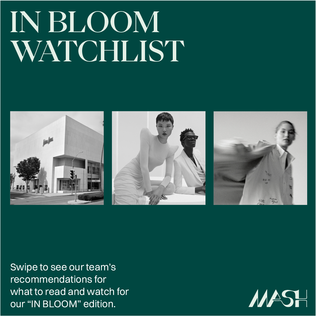
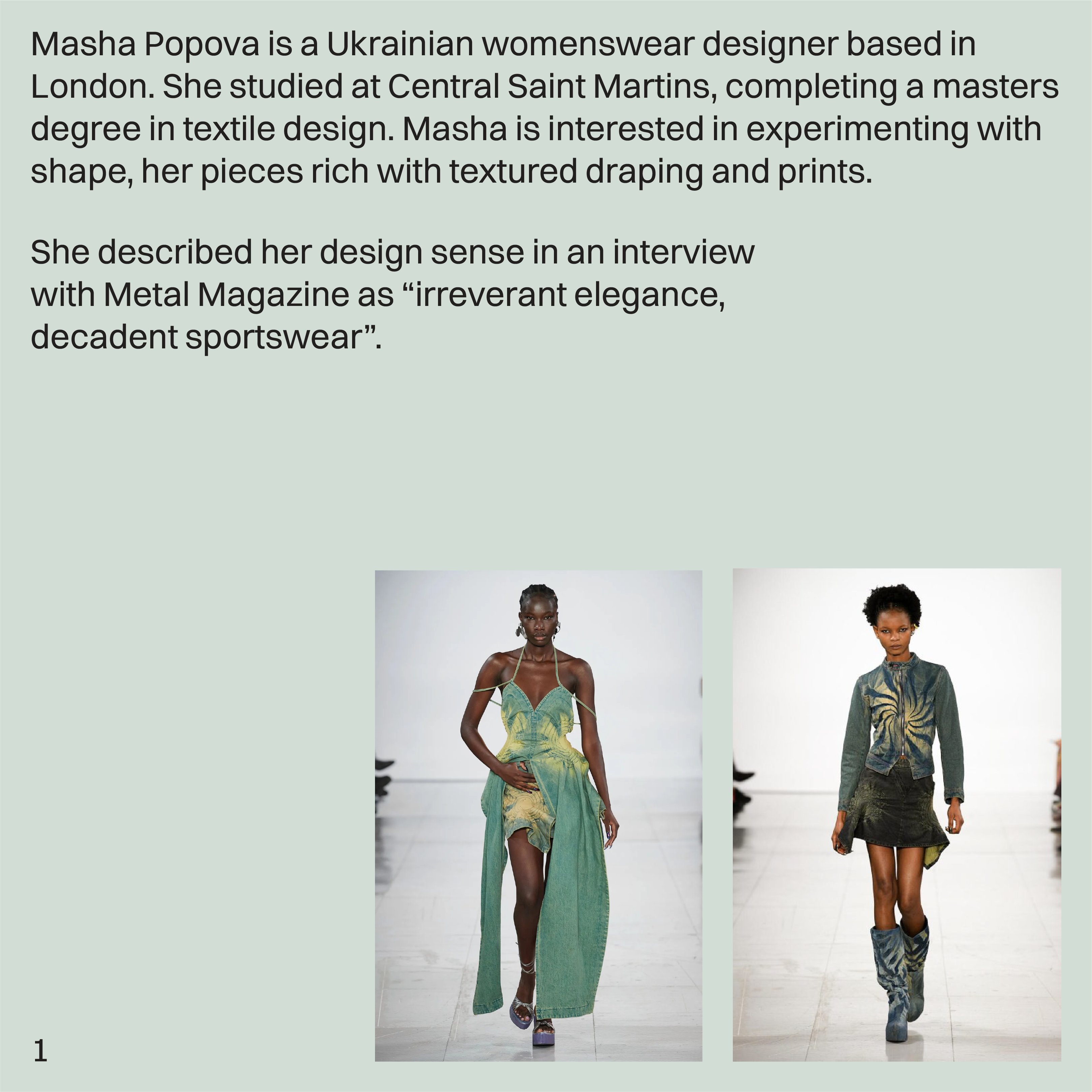
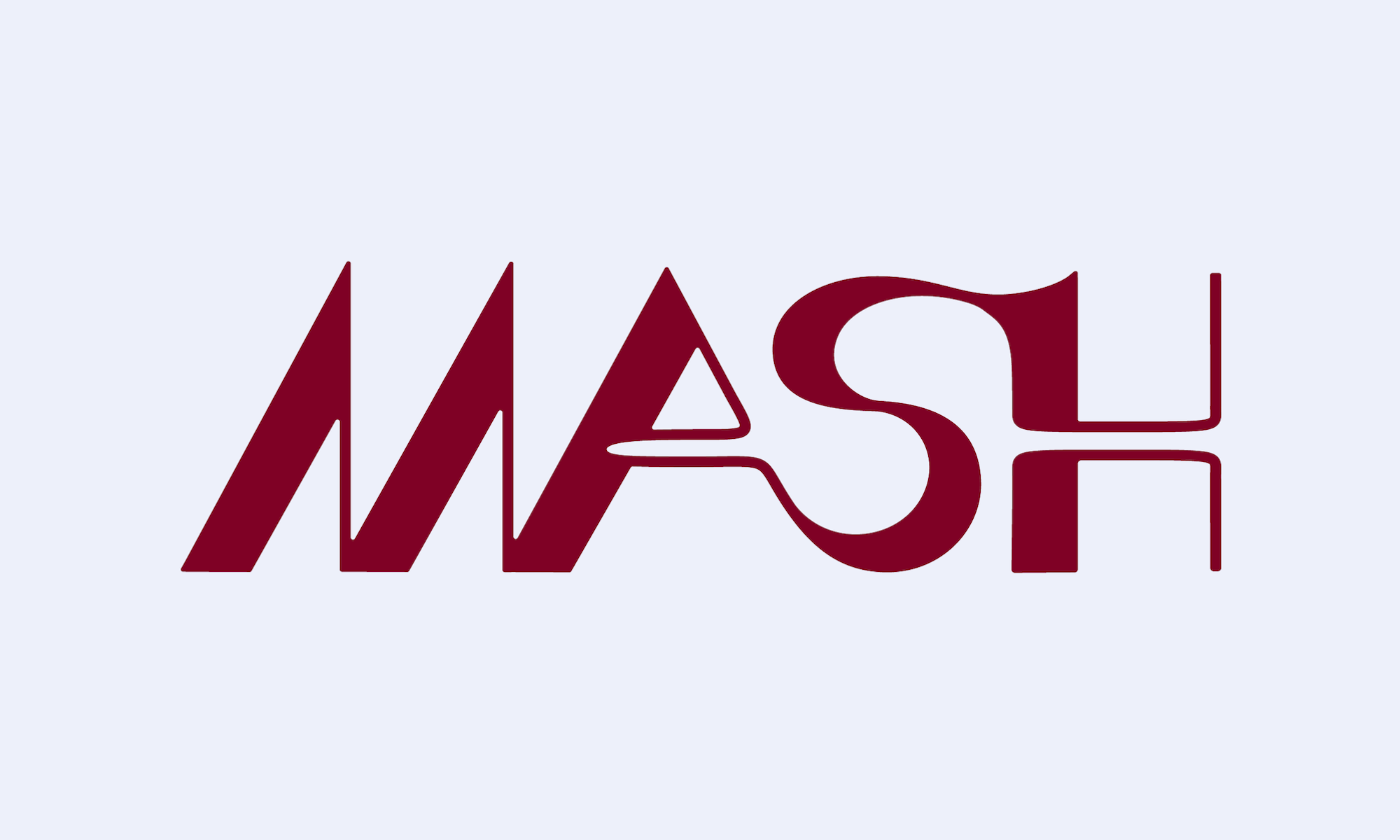
USC MASH Magazine
USC Mash Magazine is a digital publication focusing on the intersection of fashion and business. As it grew in membership and reach, the need for a clear brand voice and direction became imperative. As VP of design, I worked to develop a brand that spoke to the fun, boundless character of MASH, yet still was grounded in professionalism. With Instagram and web as our primary platforms, I designed various dynamic layouts that will adapt and grow as the organization does.
I reworked the logo to be more open, friendly, and sharp, while retaining the fluidity and motion of the old logo. The color palette utilizes a dynamic combination of cool, faded pastels and rich, saturated brights. Combining the palette with tinted photography encapsulates Los Angeles’s sun-faded aesthetic, while the darker, deeper tones keep the visual identity grounded and professional. I chose to include hues from across the spectrum as an appreciation for MASH’s ever-evolving, diverse community and content.