ASTRO
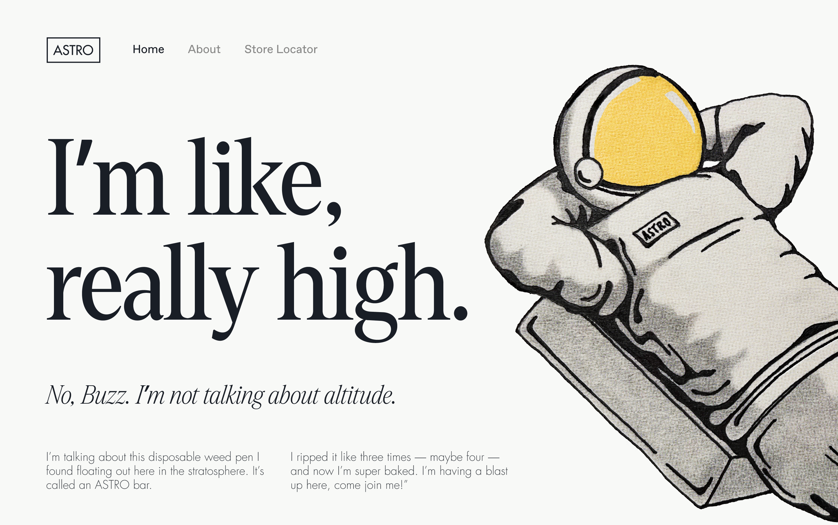
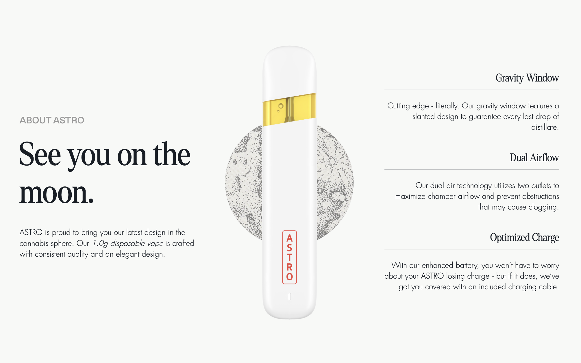
This rebrand is full of humor, nostalgia, and Space Age era illustrations. ASTRO, a high quality weed pen company, was looking for a visual identity that’s playfully self aware and embraces the laid back nature of cannabis use, though avoids weed-brand stereotypes. I drew inspiration from 1960s Marvel comics, and worked with the ASTRO team to create ASTRO himself — a chilled out, adventurous, and, well, high astronaut.
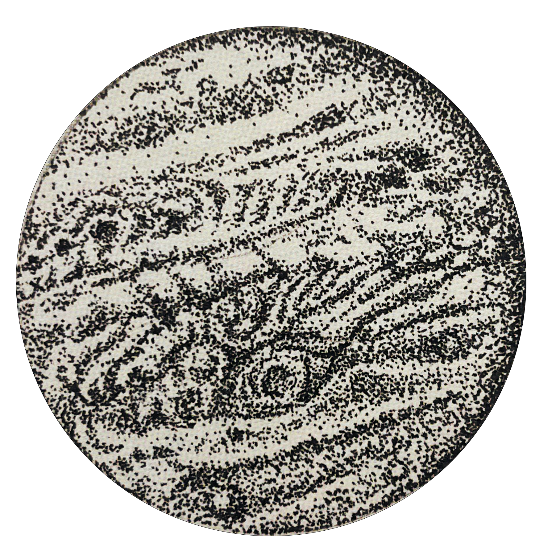
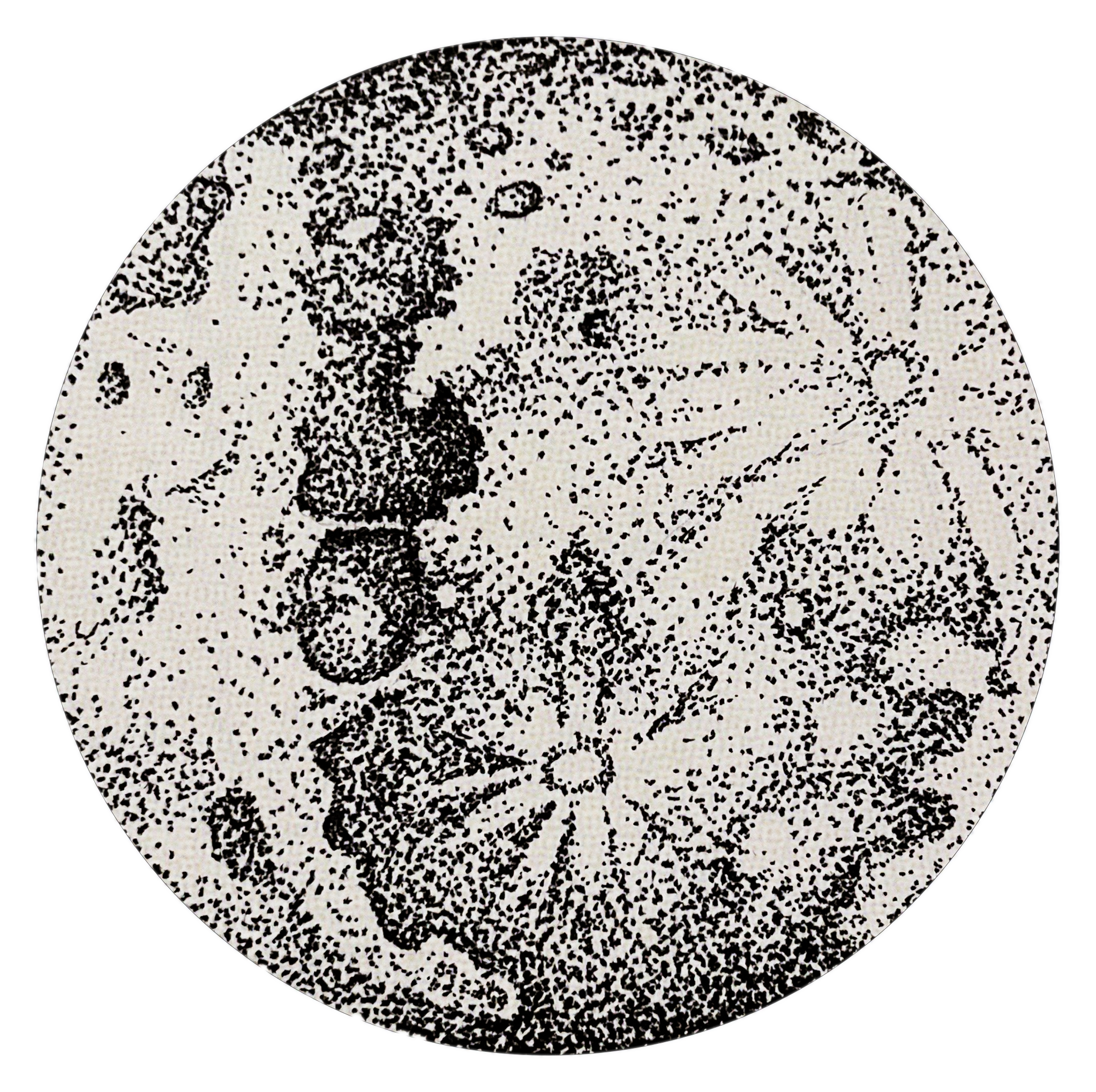
The nostalgic tone is carried over through the use of Denton Display and Futura typefaces on the website; Dinamo’s Favorit brings the brand back to present day. The color palette is inspired by moon dust and and sun-faded comic books. Web design and UX by Eli Simon.
Access the ASTRO website here.
Access the ASTRO website here.


